Jazz White Case | White marble is really elegant!
Design Reality
Here, you can experience the changing seasons, the blooming and falling of flowers, the warm weather, the blurring of the boundaries between indoor and outdoor, and functional areas, so that freedom and casualness can grow, family members can better communicate and care, and the self can be calmly sublimated.
| Design Concept |
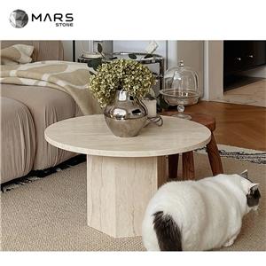
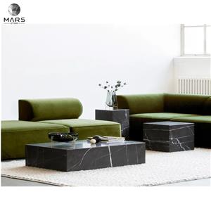
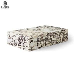
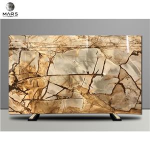
This case is a family of four post-80s. The male and female owners prefer the intellectual beauty brought by the calmness of black and gray, and like the simple and practical space experience. A daughter and a son are lively, curious, and like to communicate and be good at words. The hostess and the hostess wanted to give the children more company in this space. Jazz white marble is used in the interior to make the space more elegant.
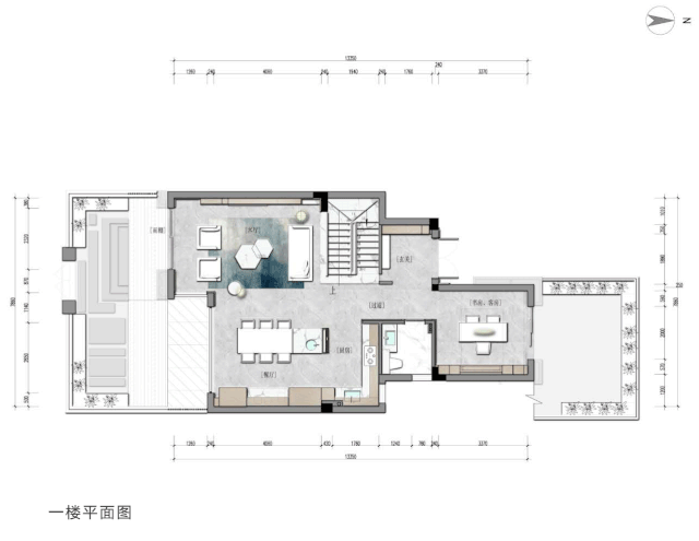
When I first entered the original space, I felt that the lighting and ventilation effects brought by the slender intermediate suites were poor, which had an impact on the living experience; I also felt that the beauty of the green shade outside the window in midsummer was a color bestowed by nature. Pure yet graceful, the beauty of human interaction with nature because of its use.
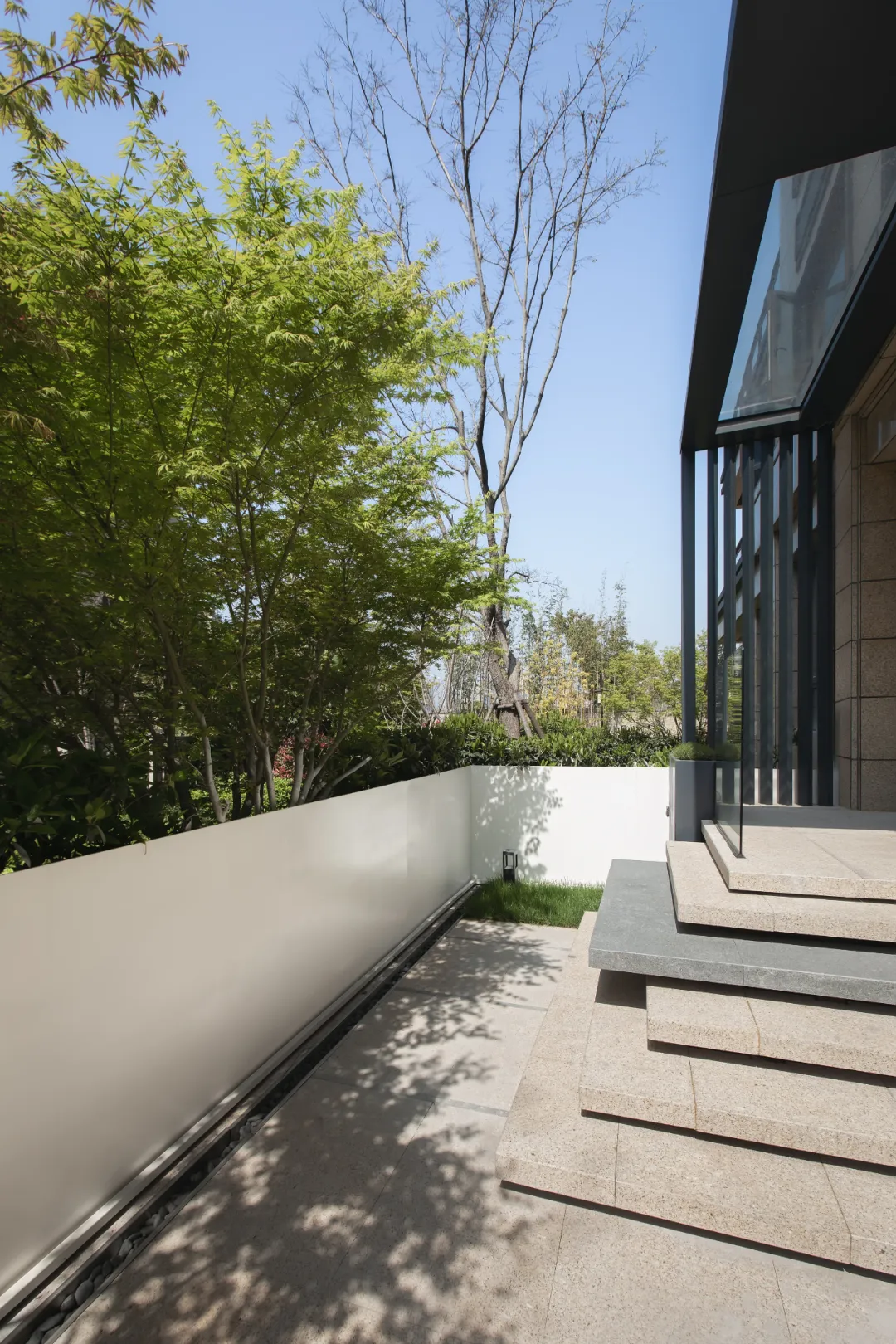
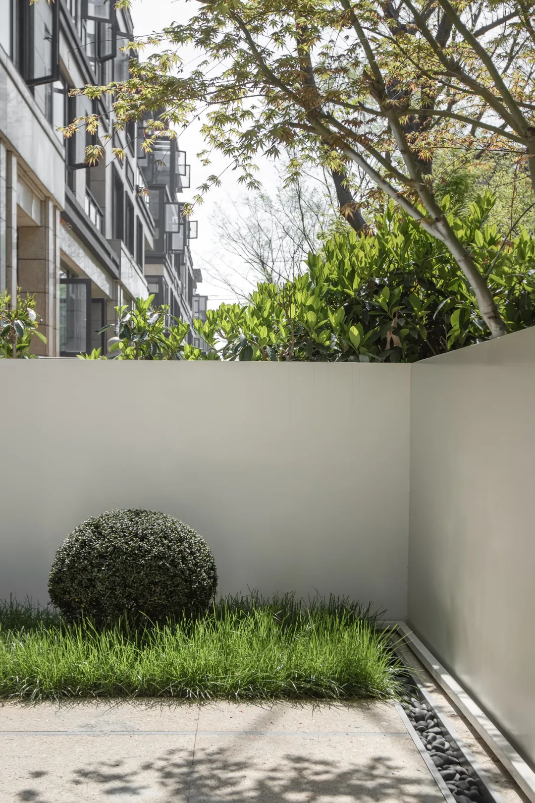
Just like the time of midsummer, the shade of the trees in the yard, the white gauze dancing in the wind, through the floor-to-ceiling windows of the living room, the outside is lush and lush. Day after day, year after year, with our family and ourselves, we experience every minute and every second that life brings to us.
Therefore, the space public area is designed in a fully open manner. The open and closeable Chinese and Western kitchen partitions, and the hidden sliding doors of the study and guest room are used to blur the spatial boundaries in all free ways and allow more light and scenery to be introduced into the interior.
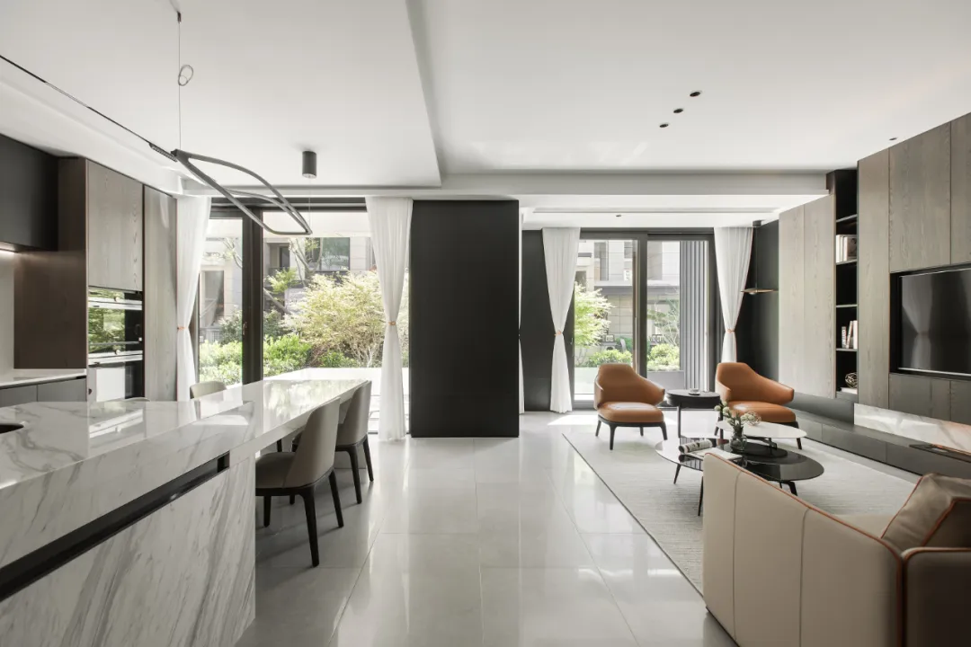
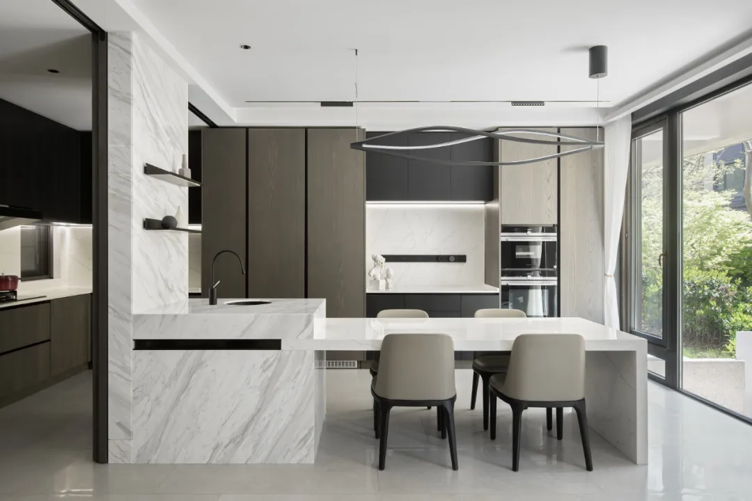
Because we are greedy for the light and shade outside the window, we made the wall between the floor-to-ceiling windows black to make it "disappear" as much as possible, and made the metal wall in the courtyard white to allow more light to reflect. Enter indoors. Whether it is dining at the dining bar or taking a nap in the living room, the sight is beautiful.
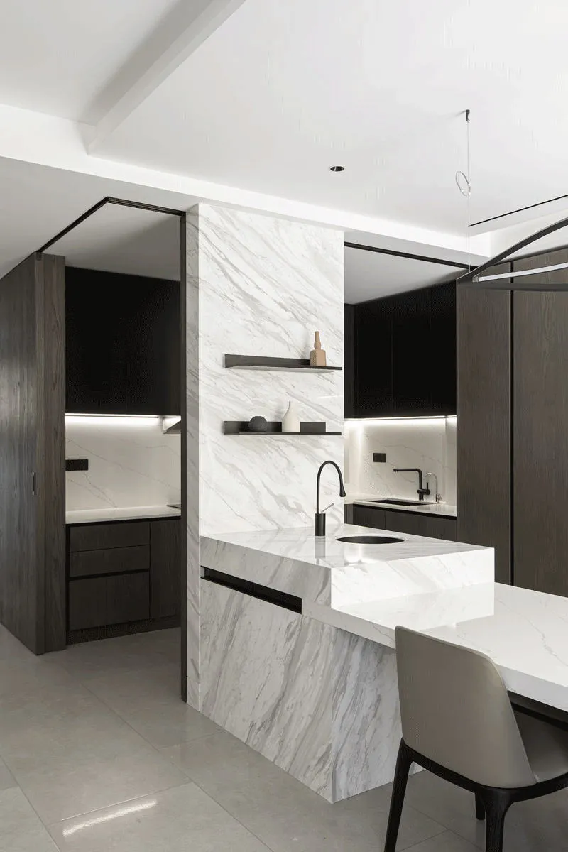
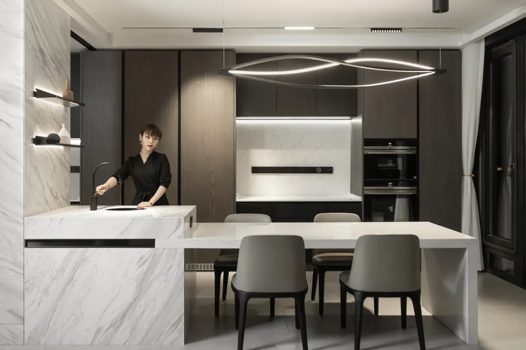
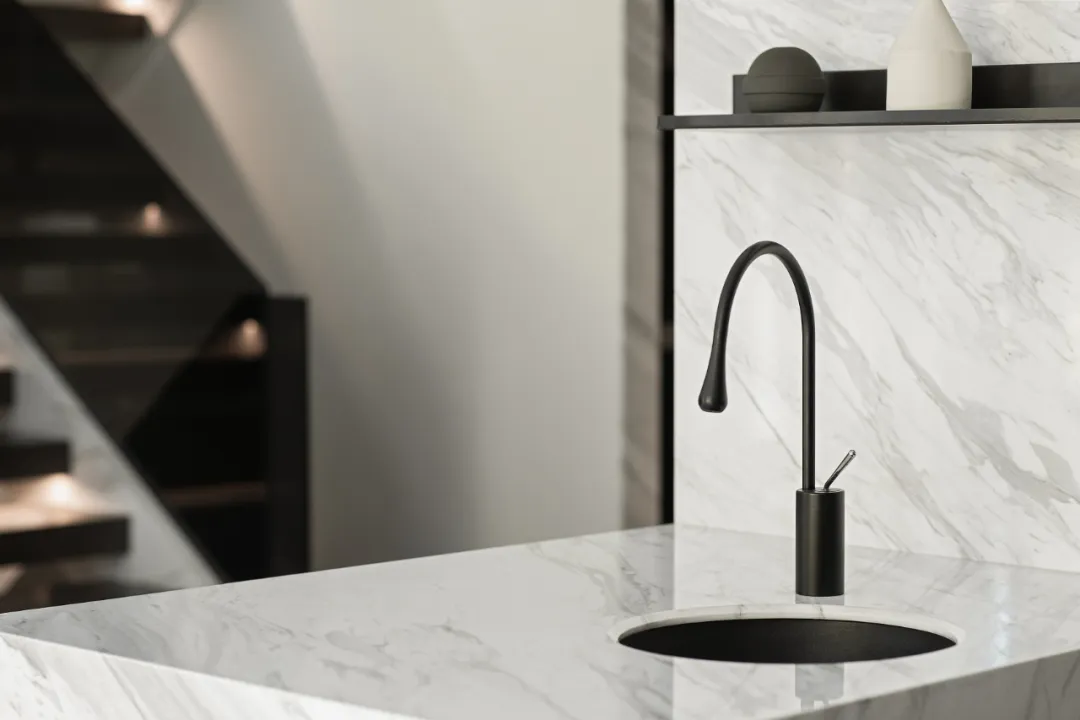
Due to the relationship between the living room and the small kitchen, after communicating with the owner and getting approval, the kitchen decisively removed the traditional dining table, expanded the original middle kitchen to the dining room, and enlarged the kitchen high cabinet, which not only could accommodate more electrical equipment, but also reached the Requirements for receiving classification. In order to meet the needs of the social culture of contemporary kitchen chefs, cooking and dining will become a space for family members to share and communicate.
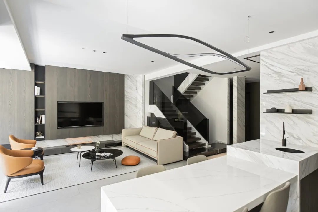
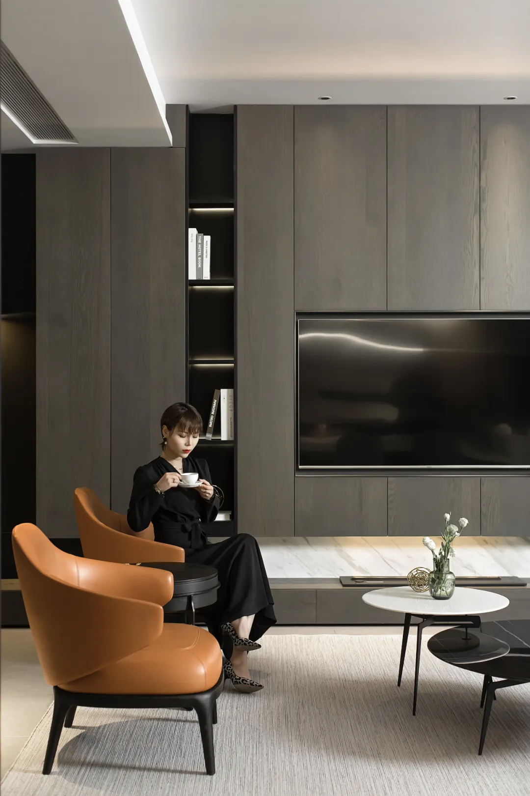
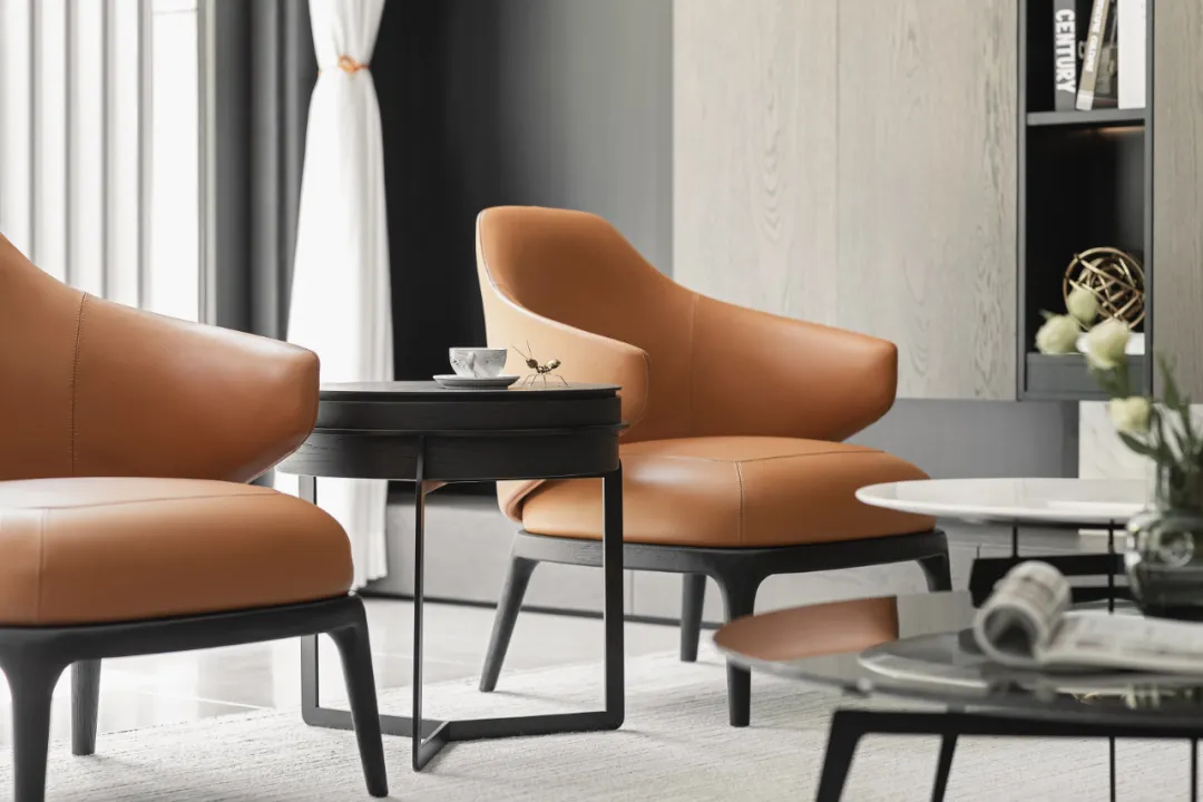
After the dining and kitchen space was released, the originally narrow living room space was extended. Set appropriate proportions of sofas, coffee tables and other furniture into a seating-style living room, abandon the "atmosphere" of the official reception-style living room, return to the original intention, and create an interactive home experience.
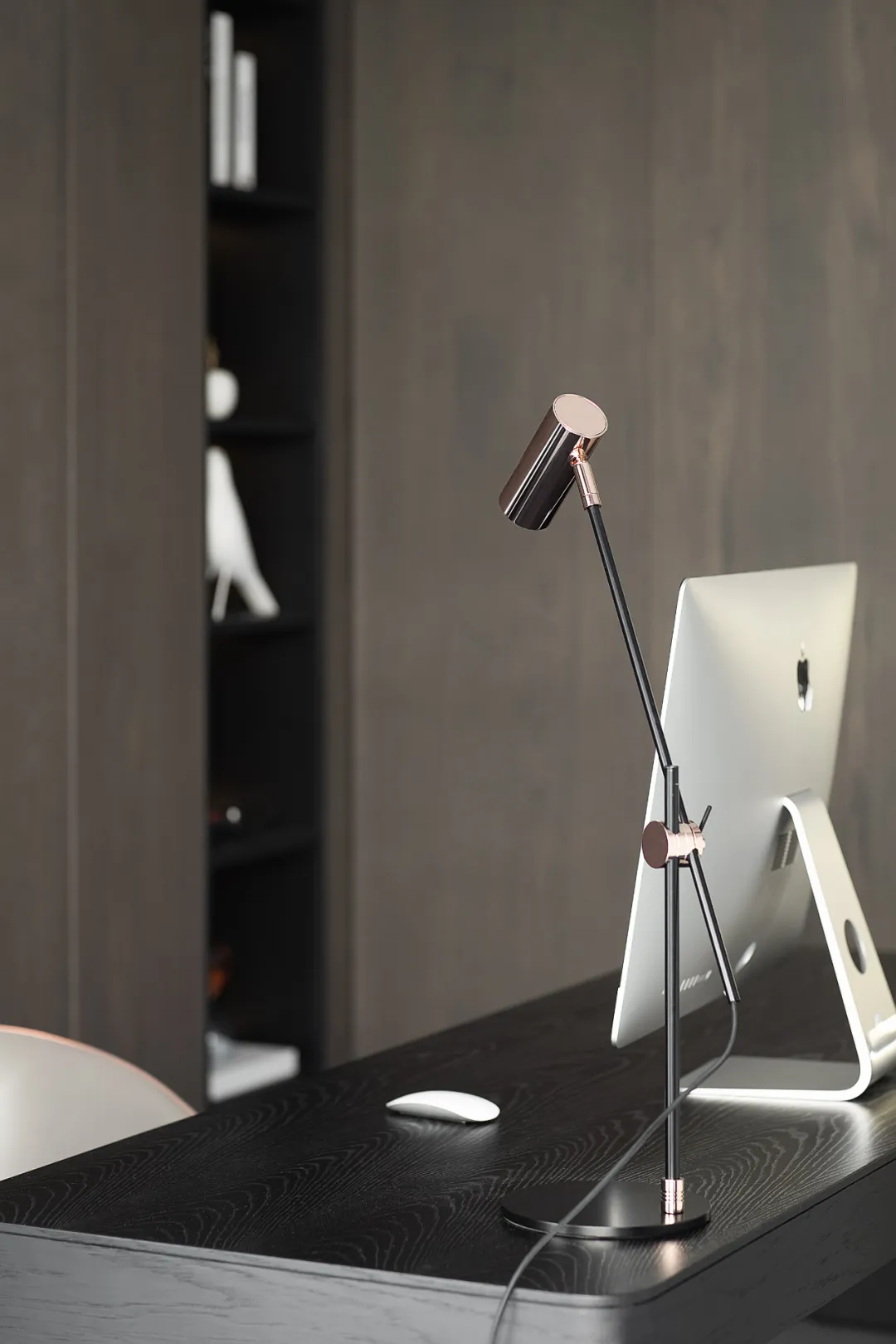
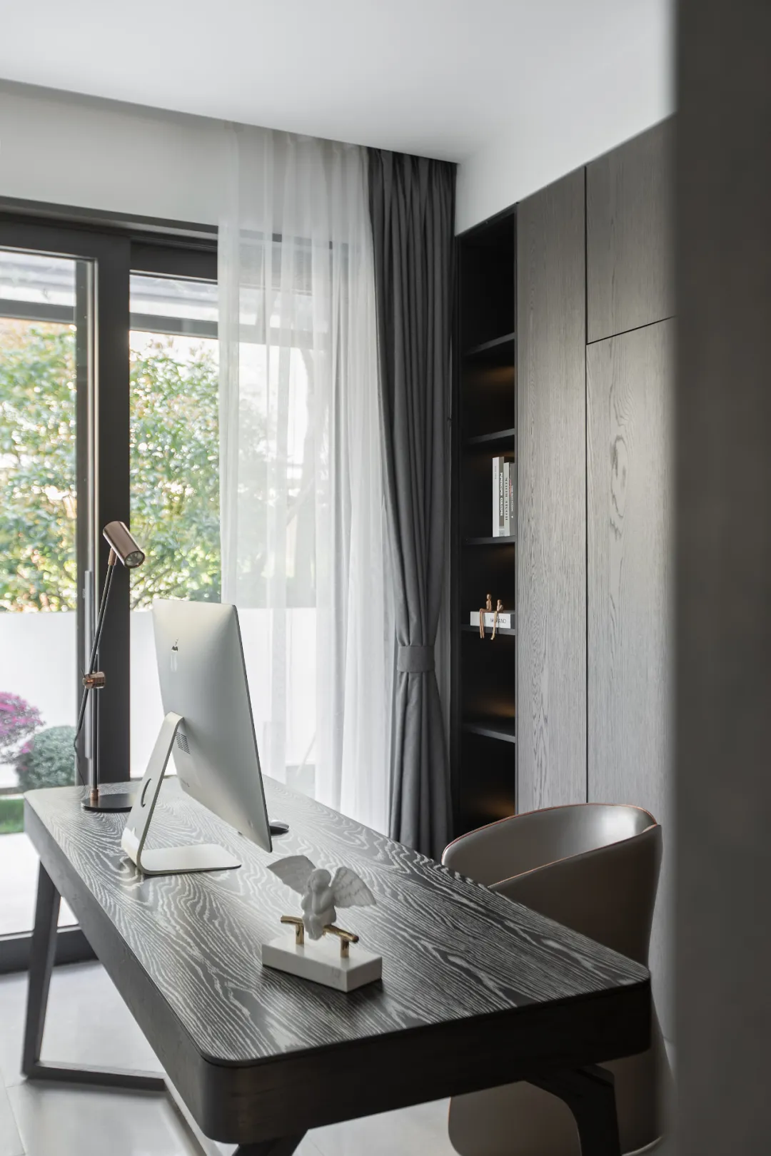
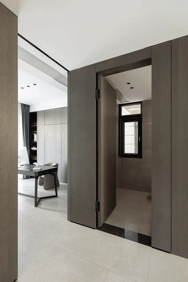
〣 STUDY
In order to further release the public area on the first floor, we chose to abandon the traditional guest rooms and hide the study door and the outer guard door. When the sliding door of the study room is pulled out, the privacy needs of the public area, the study room and the guest room are isolated. ; I like spaciousness, but I don't like too many doors, so even the guard's doors disappear together to make invisible doors. In line with our usual concept of simplicity, any functional objects appear when they are needed and hide when they are not needed, so that the space can be moved more freely.
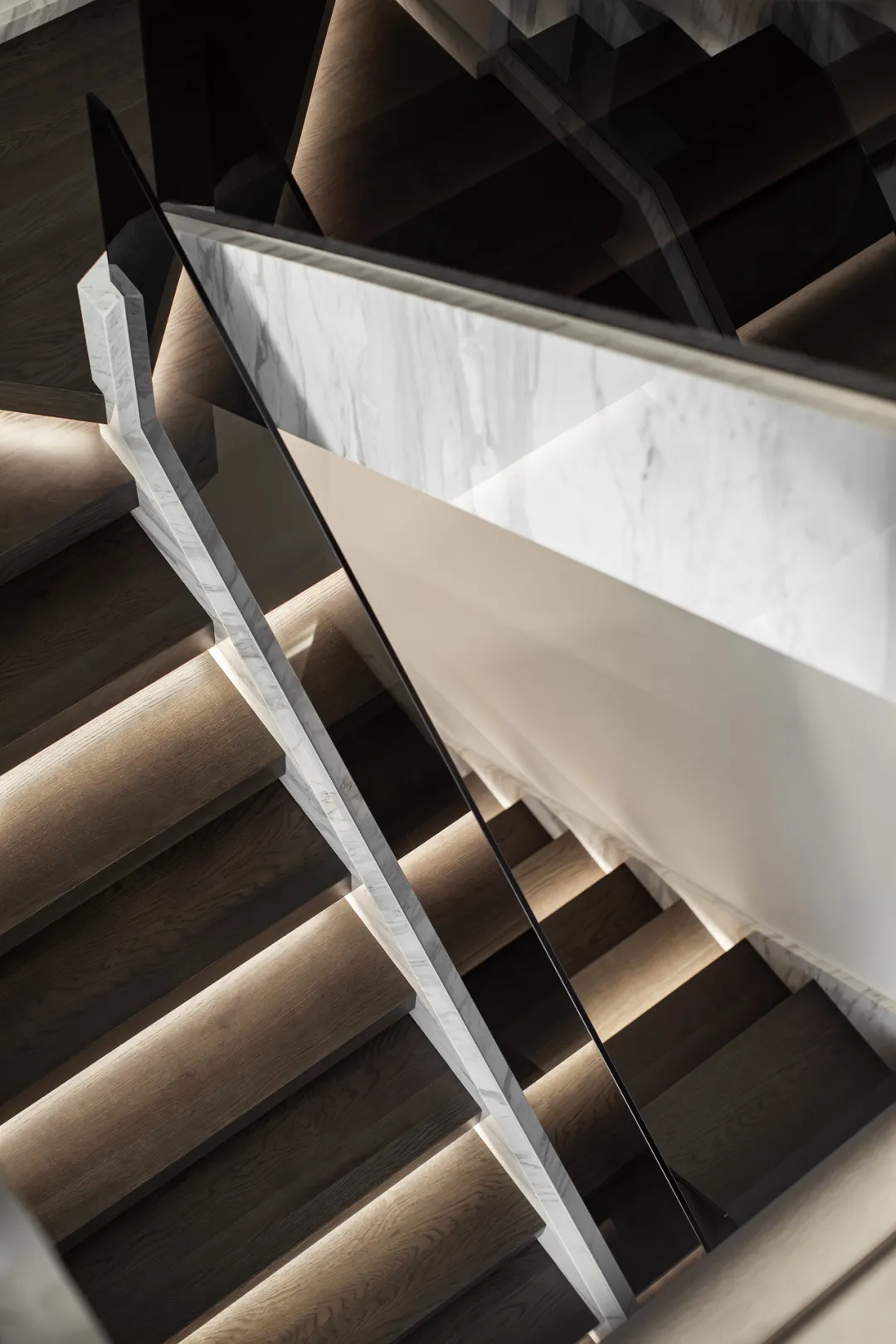
The staircase is the beauty of the soul of a space, and it is also a bridge that runs through the second floor and the lower ground floor, so it needs to be designed more rationally and more transparently. Gray glass handrails, lights hanging in the air, so that more light and wind can be introduced into the negative floor, through the passage on the second floor, to make the space lighter.
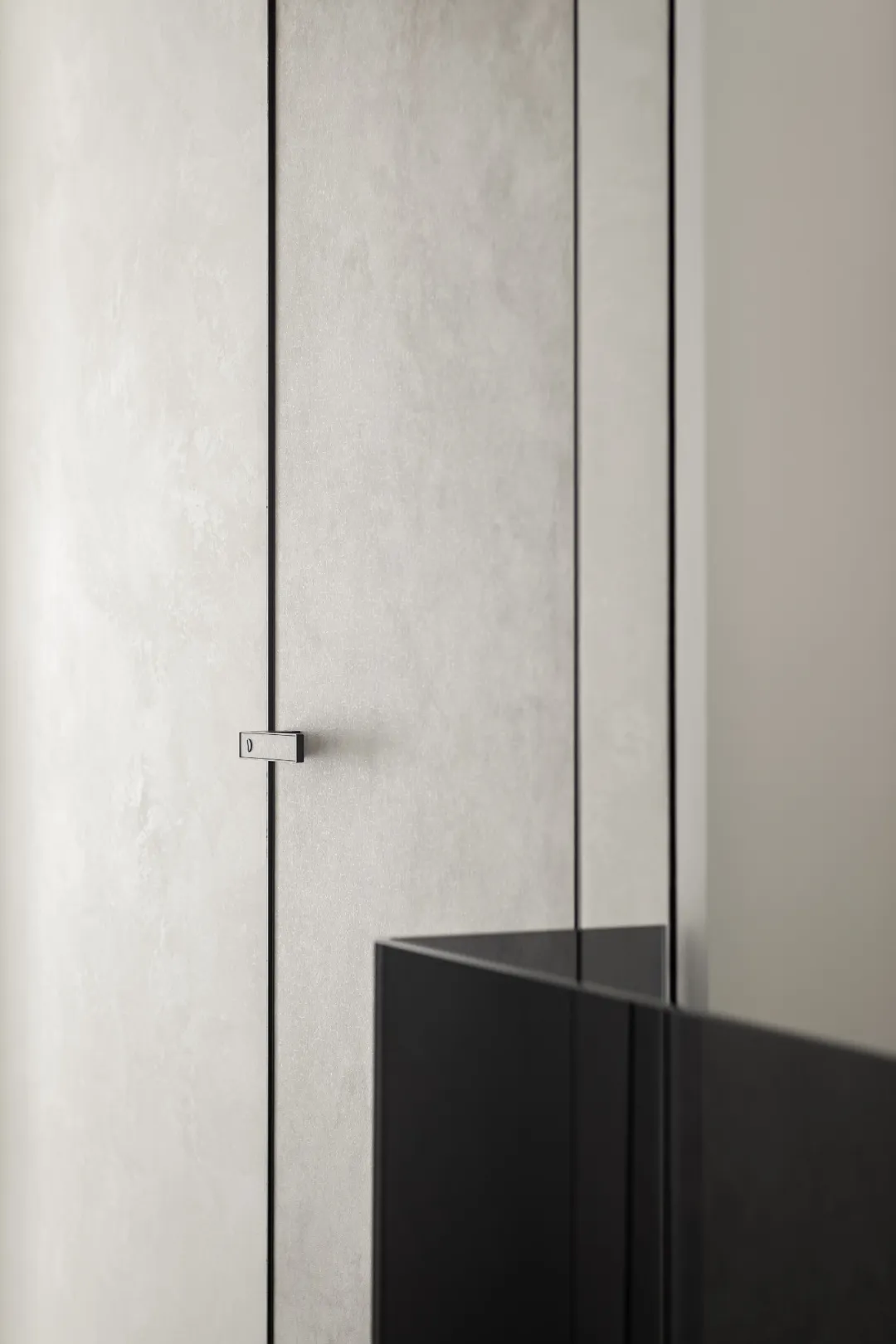
Going up the escalator, in order to make the passage on the second floor simpler, the door of the three bedrooms and one bathroom is integrated with the wall. The texture of the minimalist door is customized together with the artistic paint of the wall to make the space more transparent and more transparent. clean.
![]()
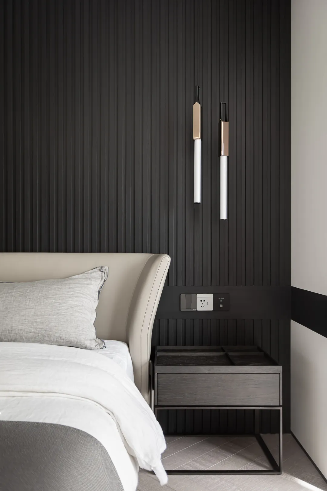
Pushing the door of the master bedroom lightly, the color tone of the entire master bedroom space presents an elegant consistency. The warm texture of the light-colored floor and the furniture give a good interpretation of the modern curve elements.
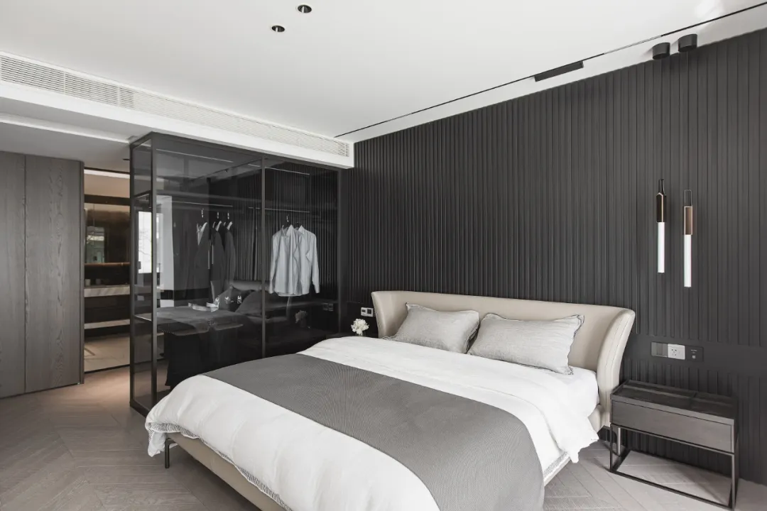
Through the fitting room, a transparent glass wardrobe was designed in the middle to solve the lighting problem and free up the space between the cloakroom and the bedroom.
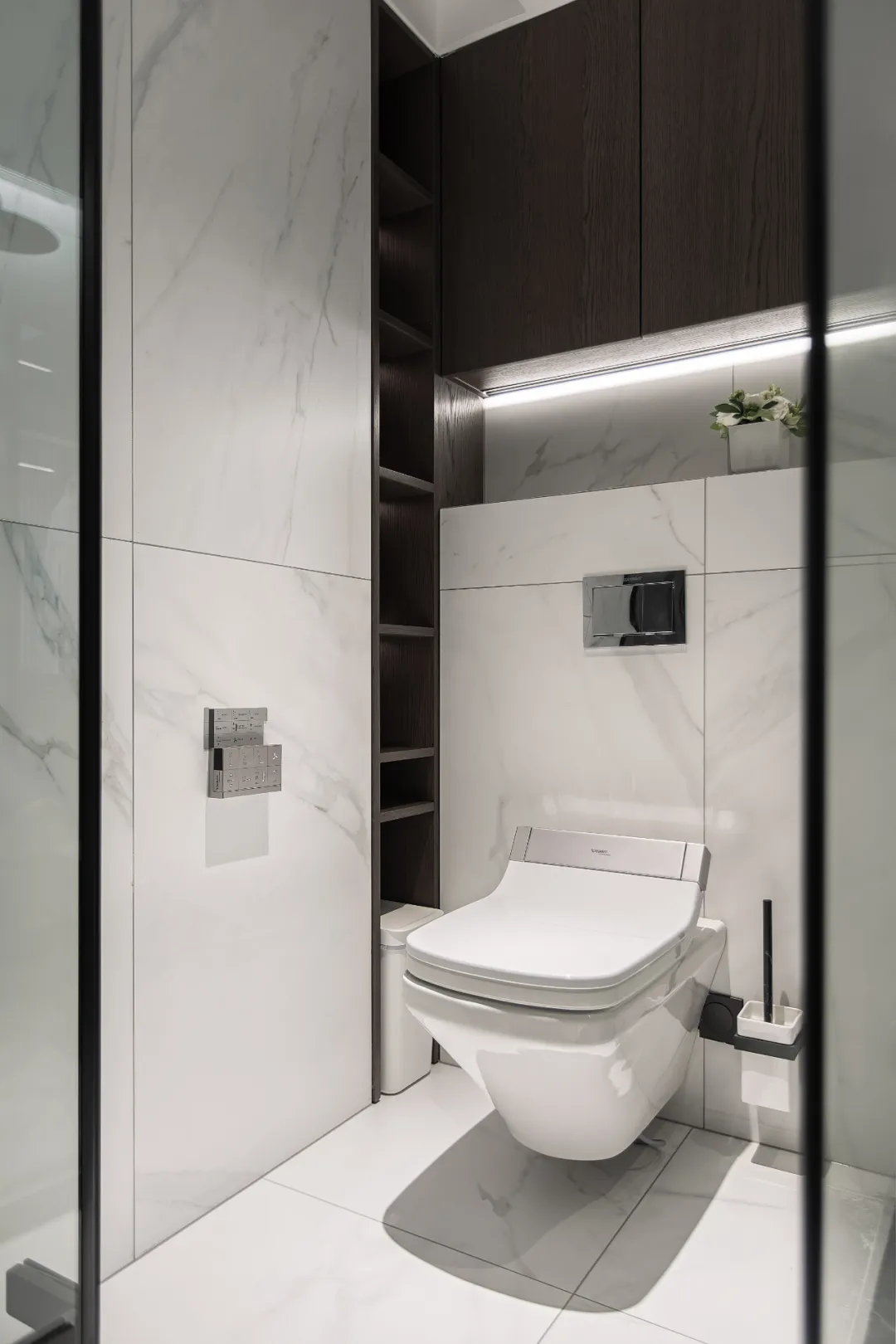
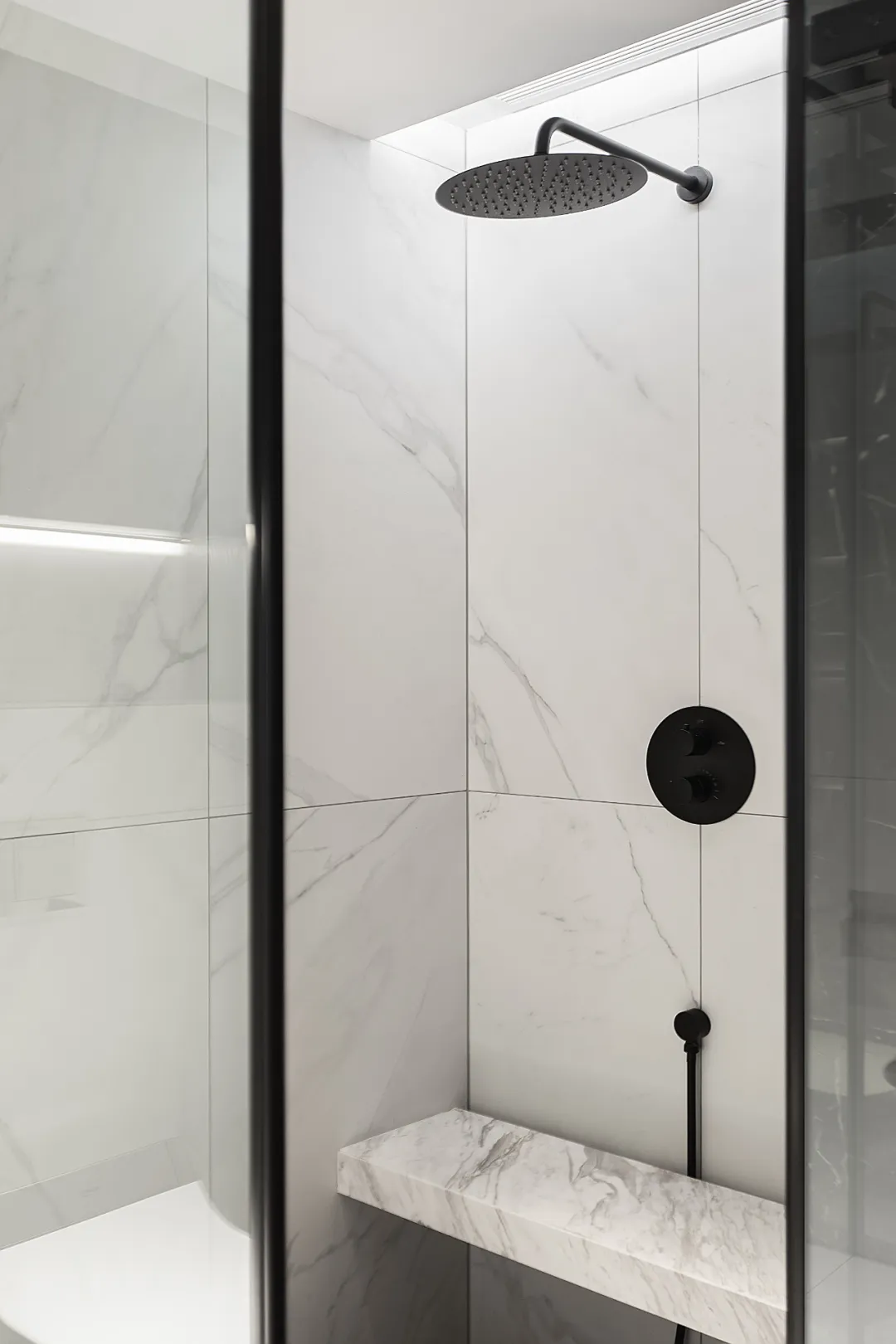
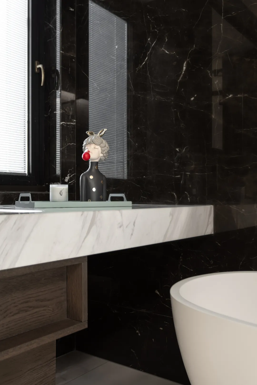
Like separate toilet room and shower, even couples need a certain sense of privacy. The toilet cabinet is designed into a small format, and every place can be stored as needed, and the shower seat can be more safe and comfortable to shower.
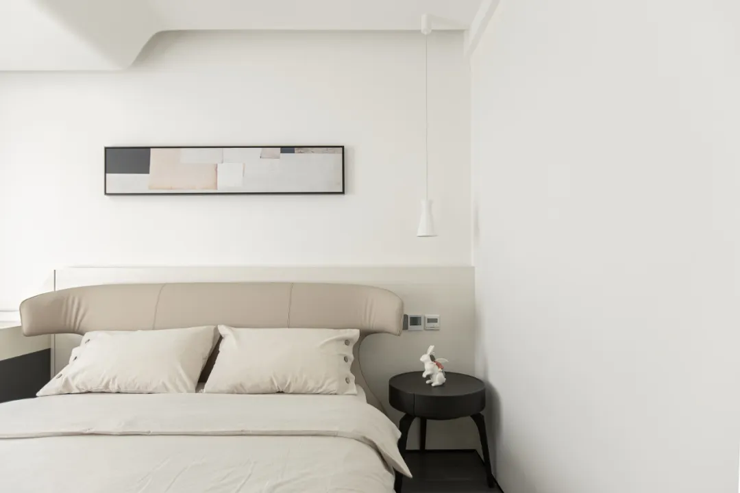
Under a pure, as if the world is at a standstill, the heart also becomes peaceful. When tranquility and comfort are integrated in the same time and space, combined with the layout of the sense of space, the daughter's room seems to be transformed into a flawless perfect world.
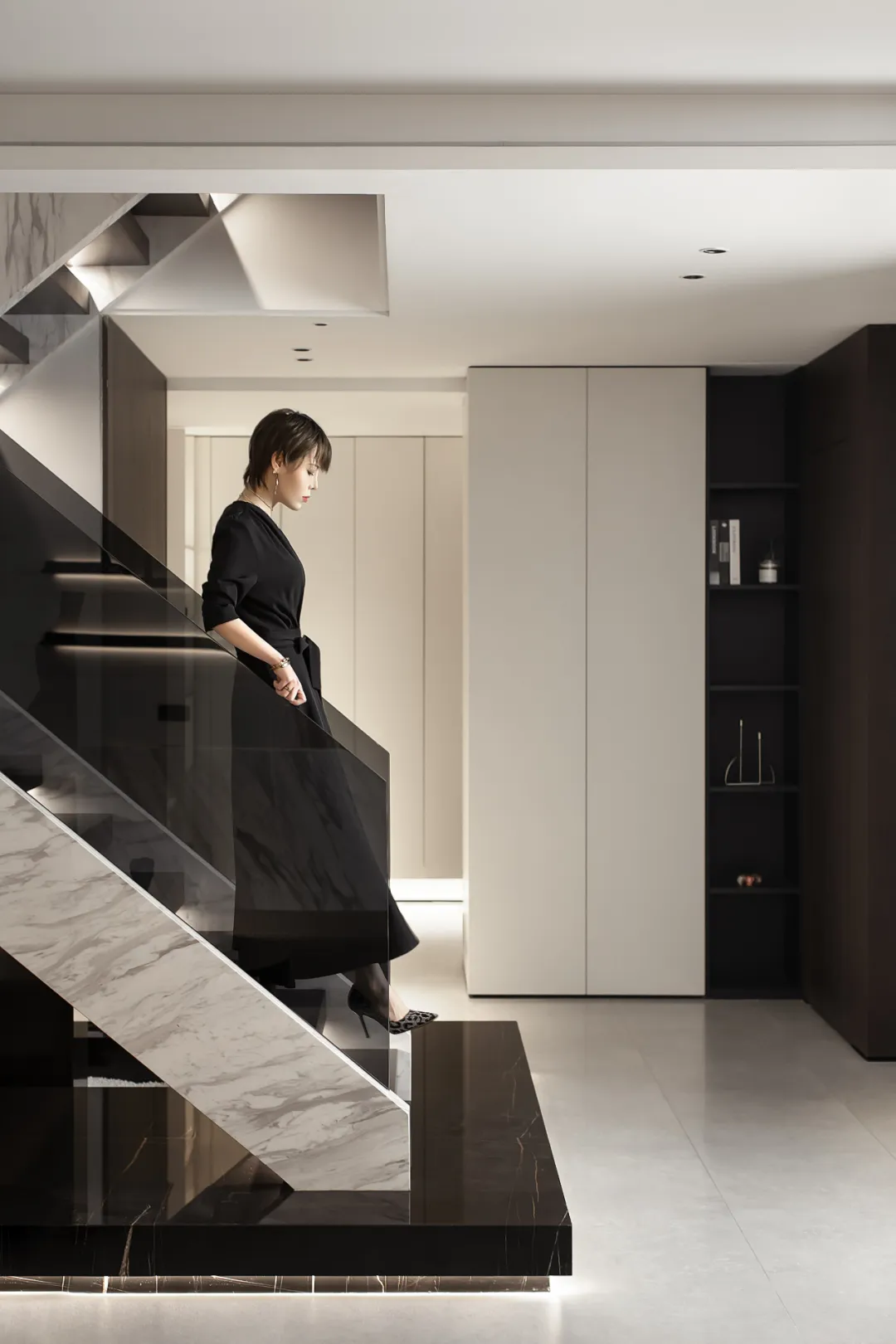
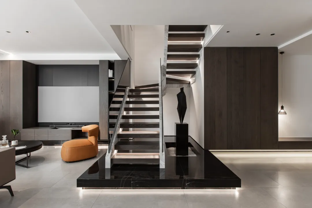
The light well on the first floor is the only "enchantment" between indoors and outdoors, so we designed a high-gloss folded surface on the wall under the light well, qualitatively named it "reflector". The light can be infinitely refracted with the surrounding walls here, increasing the natural experience of the underground space.
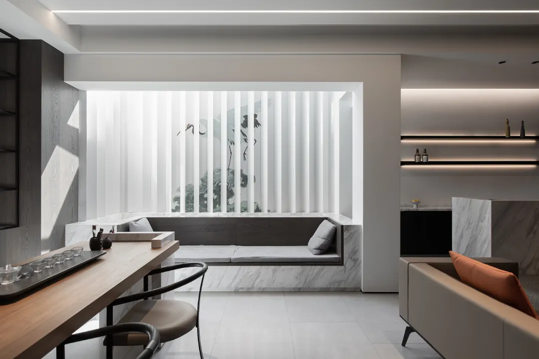
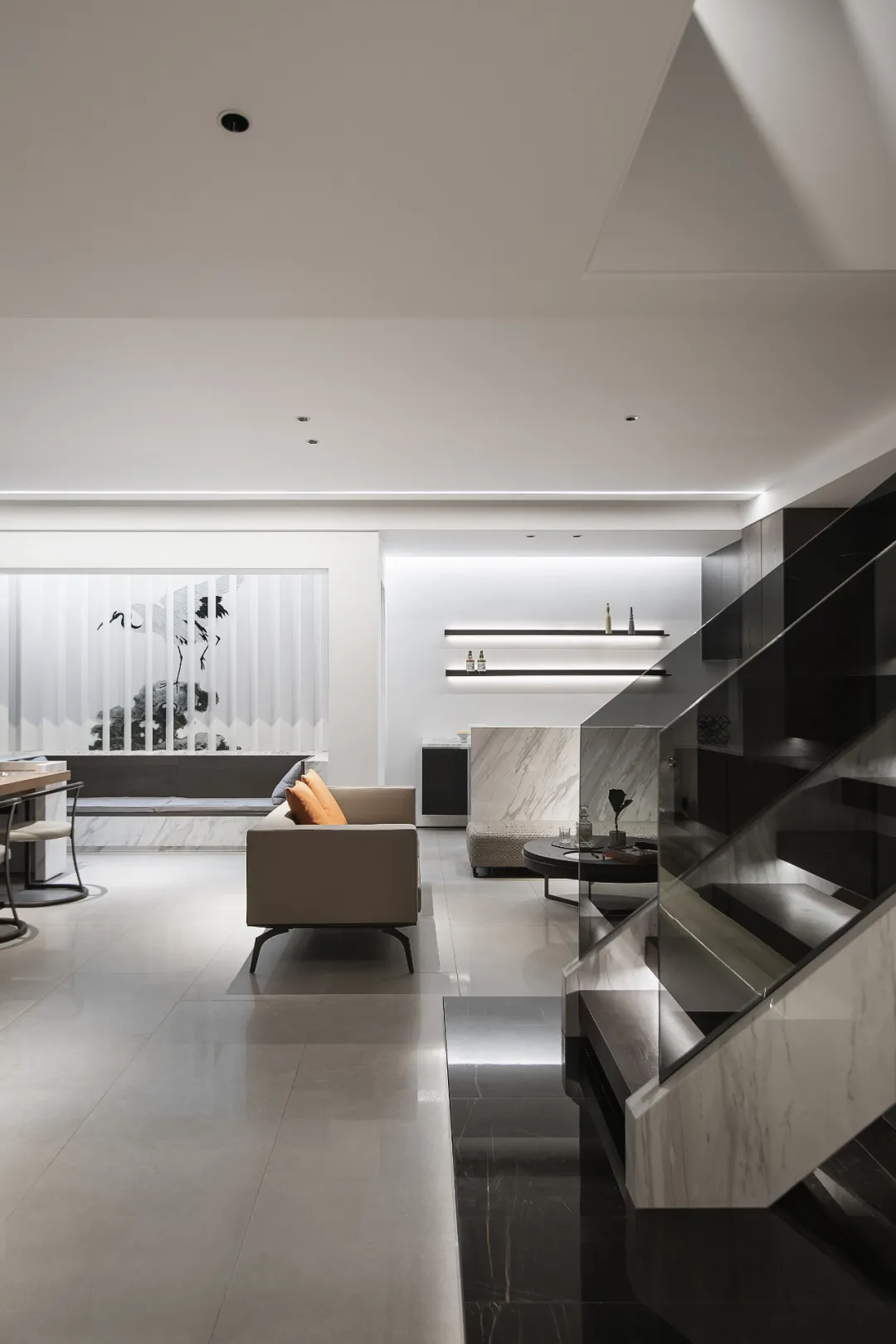
The reception room, audio-visual area, water bar, tea area and other functions are as open and integrated as possible to solve the claustrophobic feeling of the underground space and endow the social needs of family entertainment reception. The extended tea table integrates the functions of tea tasting, desk and bar table, making communication closer.
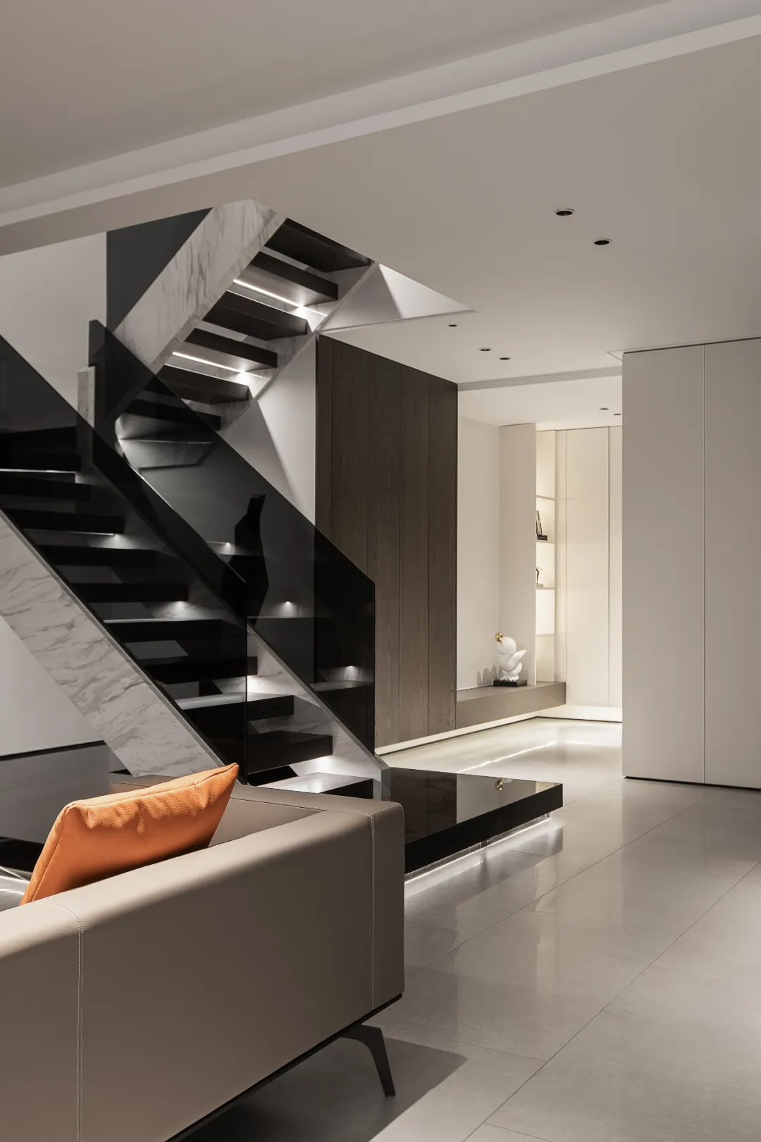
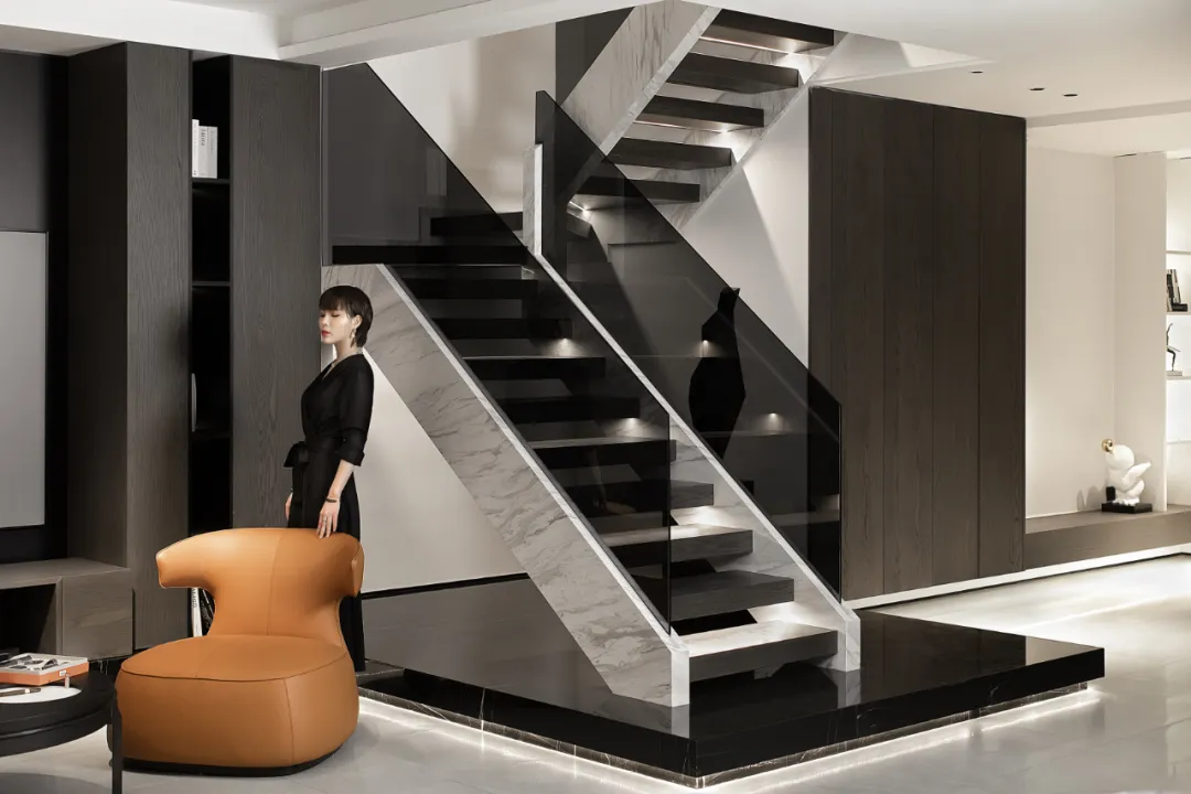
〣 PORCH
The porch on the first floor is the daily main passage for family members. Oversized shoe cabinets, lockers, and shoe-changing stools are designed here; when you return home, you can unload the "armed" of pressure, and enjoy the real inner life with your loved ones. Free and easy and peaceful.
Pursuing simplicity and purity, it is simple and neat in sense, and more elegant in taste and thought. A steady stream of art is pure and neat; through the transparent or semi-transparent design, it explores more interactive experiences, enhances the interest of the space, and enables the breath of the space to travel between different interfaces.

